A constellation of satellites, funds and international partners
Resilience Constellation invest in and develop data and information products to inform decision making by governments, financial institutions and businesses.
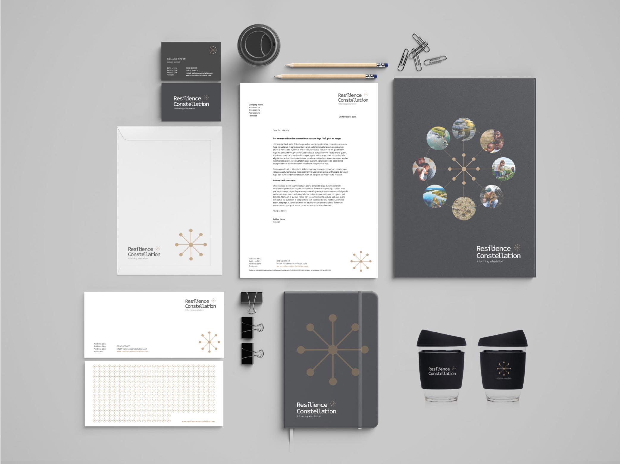
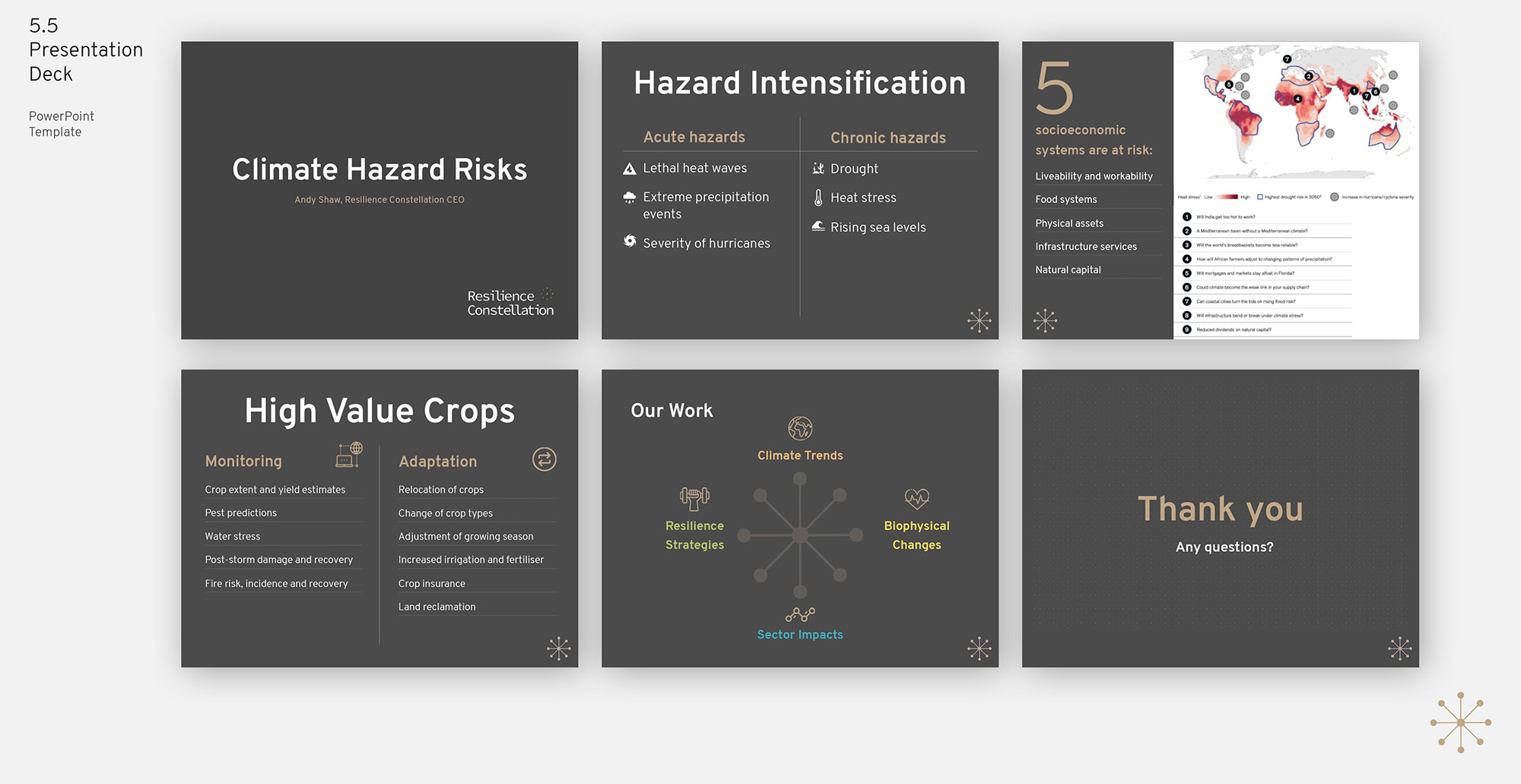
Finch Studio were approached to shape a new identity system. Our resulting ‘Star’ solution was well received. The logo can be seen as a constellation of stars or as a single star. The distinctive icon acts as a metaphor to indicate connectedness of satellites, fund/cells and international partners. This idea picks up on the mapping of earth and space and the ‘constellation’ of satellite sensors. We chose a ‘monotype’ font as this is reminiscent of the early computers that helped NASA and IBM launch the early rockets in the 1960s.